- News and Stories
- Announcement
- Principles & Practices
A New Code for America Brand
Code for America was founded a decade ago with the idea that government could work by the people, for the people, in the digital age. In the time since, we’ve partnered with governments at all levels across the country to show it’s possible to turn that idea into a reality. Our commitment to that idea hasn’t changed over the past ten years—but the landscape of our work has.
And we’ve seen that change accelerate rapidly over the past year. We’ve seen changes in leadership, both at Code for America and in government. We’ve seen changes in how government operates, and responds in moments of crisis. And we’ve seen changes in the way the public sees government services, as essential infrastructure that enable communities across the country to live with respect and dignity.
For these reasons—and many others—this moment felt like the time for an evolution in the Code for America brand.
Our new brand includes a rich, jewel tone-inspired palette and places more emphasis on organic shapes.
“At its core, Code for America’s work over the past decade and into the future remains the same: to break down barriers and make sure government can work well for everyone,” said CEO Amanda Renteria. “I joined Code for America at a moment where nearly everything about the future felt very uncertain. Over the past year, we’ve grown in so many ways as an organization. Now, as we are moving closer to the end of this pandemic, I believe we have a once-in-a-generation opportunity to reimagine how government serves communities with respect and dignity. And with that comes a new opportunity to share who we are.
“Our new brand identity represents the ways that we put people at the center of our work, especially those who need access to government benefits and services—and have too often been excluded from the design of government programs. It reflects the ways we mindfully use technology to find real solutions to the problems facing communities across the country, and work with people in those communities to improve government in meaningful ways.”
We’ve been thinking about this evolution for a while now. Any organization can decide to change their brand, but it takes time to get it right. This was a long process that brought in a lot of creative minds from both inside and outside Code for America, and we’re so proud of what we’ve built—and will continue to build. Here are some highlights of the changes you’ll see across our brand starting today.
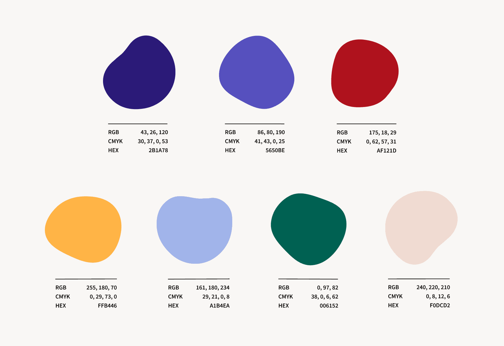
Our new color palette includes a wide range of rich, vibrant colors with warmer undertones.
Our new visual identity
First and foremost, you’ll see a new color palette across Code for America’s website and branded materials. While we liked our mostly blue and red color palette—this is Code for America, after all—it was hard to convey emotional range with limited colors.
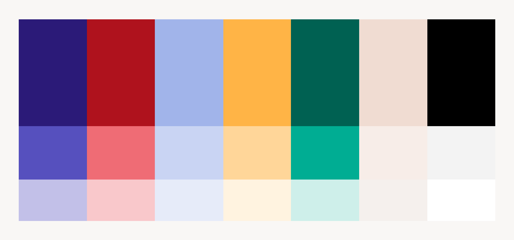
We’ve also built out a full color system with various tints of each color to accommodate for accessibility needs.
Our new jewel tone-inspired color palette has evolved with the organization, and now includes a wide range of rich, vibrant colors with warmer undertones that allow more flexibility in depicting emotional range and the human experience. We’ve also built out a full color system with various tints of each color to accommodate for accessibility needs.
Our logo has been simplified to two typographic styles, with increased line weight to improve the visual balance.
You’ll also notice an updated Code for America logo. Our old logo incorporated three typographic styles (with the “for” in cursive script as a nod to the US constitution) and two colors. We’ve kept the same text configuration, but simplified to two typographic styles, with increased line weight to improve the logo’s visual balance. We’ve modified the “for” to a stylized serif font, easing the visual tension so it is deemphasized but not lost. We’ve also simplified to a single color—either all black or all white—for accessibility/legibility purposes and to ensure consistency across all branded materials.
We’ve kept the same text configuration, but simplified from three typographic styles to two, and from two colors to one.
We’ve also placed much more of an emphasis on organic shapes as a design element to bring a more humanistic quality to our brand. The shapes add texture, movement, and visual interest, and visually support one of the things we’re most excited about: our new illustrations.
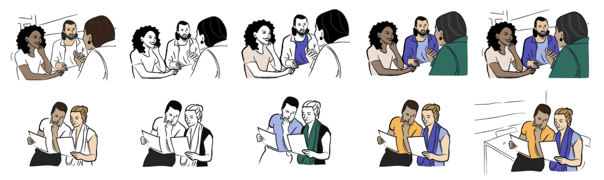
Our new illustration style reflects the ways that people are always at the center of our work.
Putting people first
In this process, we wanted to think about more than just a shift in our visual assets. With the opportunity for an evolution came lots of conversations about shifting how Code for America depicts the human experience. How do we rely less on showing what’s possible through our products and services, and more on how we center people?
People are always at the center of our work, whether it’s the clients we serve, our partners at government agencies, or caseworkers working within the systems we are helping to improve. Over the past several years, we’ve been exploring depicting their experiences through illustration—but our previous brand didn’t specifically address the use and creation of illustrations, so we ended up with multiple mismatched styles.

We’ve been exploring illustration over the past several years, but we wanted to create more consistency across our designs.
Preparing for our new branding sparked a deeper exploration into the role illustration played in supporting Code for America’s storytelling. There was a need for uniformity and consistency, and an illustration style that matched our new color palette.
Beyond the technical design elements, we wanted our illustrations to:
- Present people in a positive and dignified way. Our illustrations do not portray problematic power dynamics.
- Demonstrate our commitment to diversity and inclusion. We depict people with a diversity of realistic skin tones that represent diverse families, communities, counties, cities, and states across the country. We’ve included different shades of beige and brown with varying tones of yellow and pink. We believe this more accurately represents the people we serve by strengthening individual identity.
- Be consistent with our values and messaging. Our illustrations avoid cliches and problematic symbolism, and challenge harmful stereotypes.
- Be accessible. Our visuals are accessible to people who are blind or have any visual impairments.
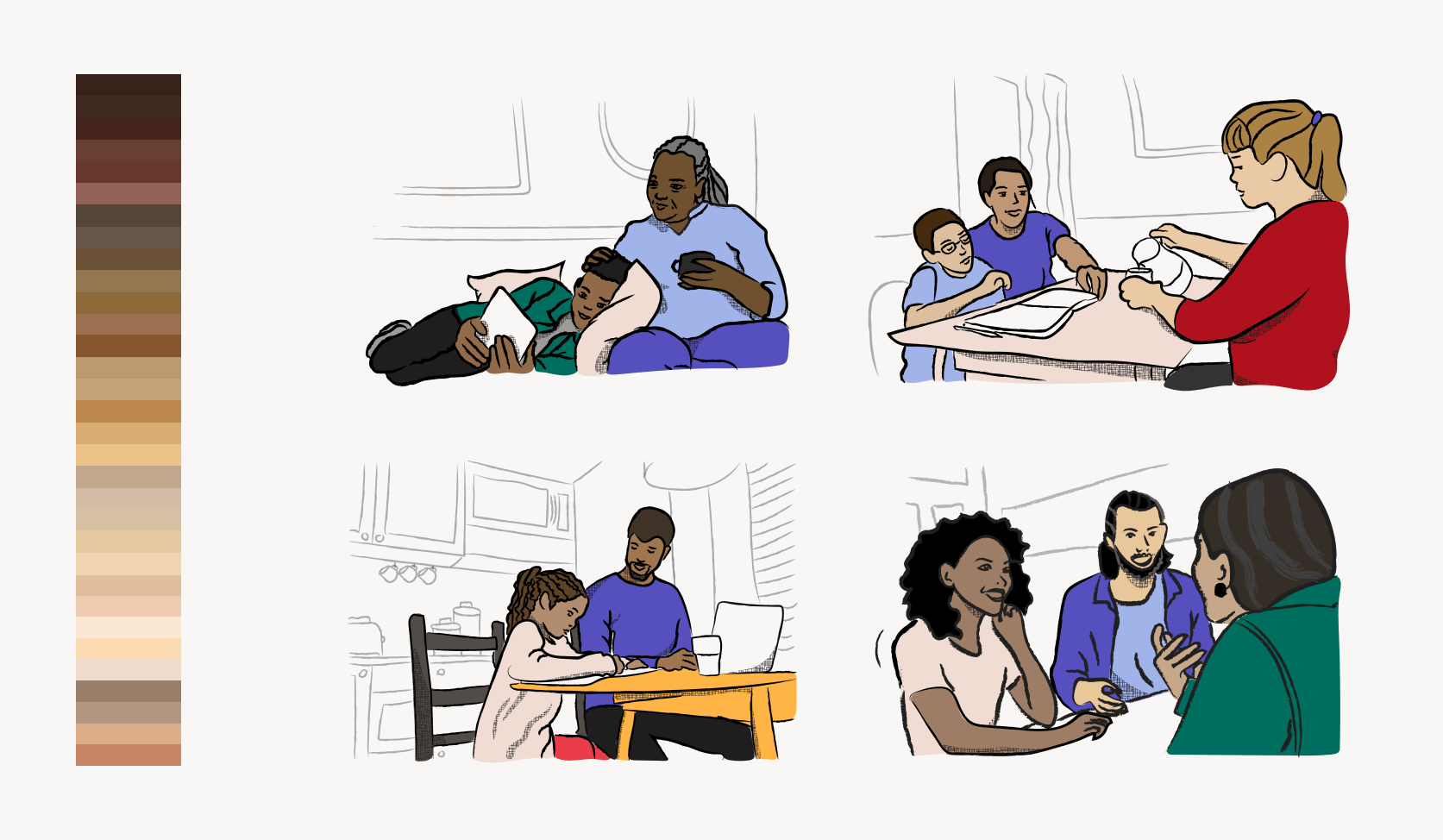
Our new illustration style features heavy black textured lines, realistic skin tones, and full-color subjects with minimalistic backgrounds.
Taking all of these factors into account, and after a lot of exploration and experimentation, we’ve landed on a new illustration style that features heavy black textured lines, realistic skin tones, and full-color subjects with minimalistic backgrounds. You can expect to start seeing a lot more of them across Code for America’s storytelling.
We’re incredibly proud of the thoughtfulness that went into every step of this progress, and grateful to everyone who played a part in it. As we look toward Code for America’s future, we’re excited to see how our work and our brand continue to evolve as we strive to create a more resilient government that effectively and equitably serves all Americans.
Want to see our new brand identity in action? Check out the revamped codeforamerica.org.