- News and Stories
- Blog post
- Safety Net
The Missed Opportunity in Online Benefits Applications: Mobile First

This post begins an ongoing series about lessons from the Integrated Benefits Initiative, which uses human-centered design and modern technology to demonstrate ways to improve how applicants can get access to SNAP (formerly food stamps), Medicaid and other services. With five small-scale pilot sites around the country, Code for America, Nava PBC, and the Center on Budget and Policy Priorities are partnering to bring best-in-class design, technical, product, and policy expertise to show how states can build human-centered services fit for the digital age. This series is intended to provide practical guidance to state officials and others on ways to create and sustain user-centered services in the social safety net.
Imagine trying to get directions to your friend’s house without using your smartphone. You might handwrite notes on the complicated journey ahead or print out detailed maps to get to your destination. Once you begin, it would be painful to start over, but you would have little recourse without other assistance. Every month, millions of Americans are trying to navigate a more complicated and more consequential journey: applying for or maintaining critical government benefits. And most states are effectively blocking what is, for many, the easiest and perhaps only means of accessing the internet: a smartphone.
The ubiquity of mobile devices has set an expectation for websites, digital services, and interactive communications to be designed and optimized for use on those devices. That expectation is not limited to online shopping or communicating with friends; it extends to any interaction with government agencies and services.
This expectation becomes a requirement for people whose primary — and often singular — method for accessing the internet and digital services is on a mobile device. For the millions of people interacting with state and local agencies to apply, enroll, and maintain public assistance benefits to weather a vulnerable moment in their lives, this expectation becomes an imperative.
As part of the Integrated Benefits Initiative *, Code for America analyzed all 50 states’ online benefits applications for five common social safety net programs:
- Medicaid , the national health insurance program for low income people
- Supplemental Nutrition Assistance Program (SNAP), sometimes known as food stamps or food assistance
- Temporary Assistance for Needy Families (TANF), sometimes known as cash assistance
- Women, Infants, and Children (WIC), a nutrition and health program for pregnant women, new mothers, infants, and young children
- Low Income Home Energy Assistance Program (LIHEAP), a program to assist families with energy costs
Our goal was to assess their functionality and ease of use. The first, and perhaps most critical criteria that we used to analyze online benefits applications was the usability and accessibility of these applications on a mobile device.
The results are eye-opening, and beyond what even we expected (and we work at the intersection of technology and government every day). A person trying to apply for Medicaid, SNAP, TANF, WIC or LIHEAP has only a 1 in 3 chance of using an online application that is mobile responsive, let alone one designed with a mobile device as the primary access channel.
In nearly every conversation we have with leaders of state health and human services agencies, we are asked how to best leverage mobile devices in eligibility and enrollment experiences. A common follow-up question is whether to build native apps or to have separate mobile and desktop experiences. We believe a foundational first step to maximizing access is getting these questions right.
State health and human services agencies must design and implement online benefits applications that are mobile first and mobile responsive.
Why does this matter?
Through Code for America’s work in the Integrated Benefits Initiative and running GetCalFresh, our digital assister that processes 10,000s of California food stamps applications each month, we have seen firsthand how much people who need government assistance rely on mobile devices. For instance, more than half of Google searches for food assistance in California are from a mobile device. One client in Colorado put it quite simply: “ My phone is my computer.”
2018 was a historic tipping point in the way Americans use the internet. For the first time, more American adults own smartphones (78%) than desktop and laptop computers combined (73%). Even more critical for a state agency perspective is the emergence of smartphone-dependent households. The percentage of households who do not use broadband internet at home but own smartphones has increased from 8% in 2013 to 20% in 2018. Perhaps most striking, two out of every three adults with income below $30,000 per year own a smartphone, and 31% of them exclusively rely on a smartphone for access to the internet.
I kind of hate computers. They break when I touch them…. I just have my phone — that’s it.
— Client in Alaska
Mobile first is the idea that websites (like those for online benefits applications) should be built with the insight that users will access them primarily from a smartphone (rather than a desktop computer). When you open a webpage on your phone and it automatically resizes to fit your screen and navigate in a way that feels intuitive to the touchscreen in your hand, that’s often described as mobile responsive . Designing safety net benefits applications to be mobile first and mobile responsive is simply a way to put users and their needs first. At Code for America, we consider this a prerequisite when building any client or consumer facing digital experience, and state agencies should too.
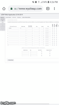
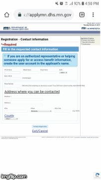
Desktop layouts become unreadable on mobile devices
Online applications become unreadable on a mobile screen when they aren’t properly formatted for the screen size and dimensions. Prompts can either shrink to minuscule, indecipherable fonts or extend far off the edges of the screen, requiring deft fingers to scroll and navigate a maze of fields and input boxes. When users have to input information the experience gets even worse, as these websites struggle to accommodate on-screen keyboards.
The most challenging online benefits applications feel like a chart from a caseworkers’ clipboard pasted into a web browser and viewed one square inch at time.


Desktop interactions often don’t translate to mobile
Many websites use design features that may help guide a user on a desktop computer, but become barriers to completion on a phone, where users interact differently with the screen. For instance, pop-up windows, links to new pages, and text that appears when links are clicked can create confusion when appearing on a mobile phone. They often do not display properly, and even if well-executed, can be a jarring experience for users. It’s the visual equivalent of being put on hold without warning during a customer service call, again and again.


During one of our user research sessions, it became obvious that applying by phone is often not a choice but a necessity:
Applying online would be so much easier…I don’t have internet in my house. I have internet on my phone. I’d probably do it there.
— Client in Alaska
The bottom line is that users will try to apply for online benefits applications with the device they have at hand. Without mobile first, mobile responsive online benefits applications, user interactions break down and services fail to reach those who need them most. We believe that eligible users should have an effective, simplified application experience to get the benefits they need. Cumbersome and confusing desktop websites are the digital equivalent of a WIC clinic closure — people are denied services. When online applications are effectively broken from a user perspective, real people lose needed sources of support.
Native mobile applications are not the answer
It is tempting to think that native mobile applications, like those you download from the App Store or Google Play, would be a good solution to some of the usability challenges outlined above. At least nine states have invested significant time and resources to develop and launch native applications related to benefits programs. But having worked in this space for almost a decade, we have several reasons to believe this strategy is inferior to simply building mobile first state online applications.
First, it takes significant, specialized resources to develop and launch a native application. Android is by far the most popular operating system for low income populations, but it is notoriously difficult to build native applications that work across the range of Android devices. States are also ill-equipped to deal with maintaining native applications, especially amid their more pressing day-to-day priorities. Mobile first, mobile responsive web applications simplify the workload — there’s a single interface that is easier to keep current.
Second, consider the value of native applications from a user perspective: most popular native phone applications are used weekly, if not daily. Very few users are willing to download a native application for a single use or for interactions that occur only every six or 12 months (like when a benefits renewal is due). Furthermore, native applications require a range of permissions and access to your phone, which implies a degree of trust between the developer and the user. Unfortunately many segments of the population that apply for benefits have low trust, or at least low familiarity, in state health and human services agencies. They may balk at installing a clunky native application (and its necessary updates), or simply lack access to the fast, stable internet necessary to download native applications, which can take up significant phone storage space.
Finally, native applications require a user to start and finish an application on the same phone, but users access the internet through a growing range of devices — computers, tablets, and phones (not to mention that they may be personal, work, or public devices). Furthermore, many low income applicants cycle through personal phones or borrow them from friends or relatives to complete applications, which makes using native applications impossible, since a user must re-download the application or may not want to for privacy purposes. Mobile first websites avoid these issues altogether.
Charting a better path forward
Our landscape assessment revealed what many people who access safety net benefits already know: in most states, it is either impossible or deeply frustrating to apply or maintain benefits using a mobile device. For state administrators, it can feel daunting to know how to channel the mission of the agency into products that meet the needs of users. But it’s not impossible. For instance, Massachusetts has a one-page, mobile responsive form to begin the WIC application process (compared to 10 or more non-responsive pages for the same program in other states). California’s CalWIN online application works great on mobile devices, and it takes only 30 minutes to submit a combined application for SNAP, Medicaid, TANF, and WIC.
Through our Integrated Benefits Initiative pilots, Code for America is pushing the envelope on what’s possible. We recently concluded a pilot in partnership with Civilla, a design studio in Detroit, and the Michigan Department of Health and Human Services (MDHHS) to streamline a mobile first online application for SNAP and Medicaid.
After extensive user-testing and iterative updates, our mobile-first application offered a significantly better user experience. Some of the principles we implemented in the application based on user feedback included:
- Require minimal typing : Tapping is the easiest mobile interaction, so limit switching between tapping and typing as much as possible.
- Provide a sense of place and time : show progress made on the application using broad sections and transition pages
- Design for accessibility : use large tap targets, wide buttons, and large dropdown inputs to make it easy to share information
- Use plain, friendly language : use a conversational tone that feels warm and inviting, rather than opaque or judgmental
One Michigan case worker shared her reflection:
That was amazing! I did the app on the resident’s phone and he finished in 5 minutes. He was so ecstatic that he could do that.

That’s a really smooth process compared to what it’s been like in the past for me applying. I think everything looks really nice, the balance of information is perfect. Putting everything in was really easy to do, I only got one error, and that was really easy to fix. Usually you get a bunch. — Client in Michigan
More than 1,500 applications serving more than 2,700 residents were submitted over nine months in Genesee County, the home of Flint, Michigan. The results illustrate the potential of mobile first, user-centered online applications:
- Median time to apply decreased from 45 minutes to less than 10 minutes
- Days to determination decreased from 13 days to 11 days
- Approval rates for applications increased from 53% to 71%
You can read more about the Michigan work in our blog post and the final report .
What’s next in mobile first benefits applications
For the leading states who have already built mobile first online applications — and are iteratively improving them based on user feedback — the next steps are to unlock the unique capabilities of smartphones. These could include allowing users to upload required forms by taking a picture of them or using the phone’s GPS to connect users to the nearest case office or WIC clinic.
User expectations for simple, responsive interfaces with government services are only going to grow, as will smartphone-dependent households, especially in lower income families. State agencies that adopt mobile first, mobile responsive services as a default will be in a better position to deliver effective, efficient experiences.
Go digital! I mean really, everybody is getting into it. It’s easier…I could [apply for benefits] on my phone. I’ve done so many job applications that took a long time from my phone.
— Client in Michigan
We have much more to share about the state of safety net benefits applications across the country. This post is one of several that we will release in the coming months with our Integrated Benefits Initiative partners like Nava PBC and the Center on Budget and Policy Priorities about opportunities we see to improve the delivery of safety net services. Ultimately, we hope to inspire wider change in how governments consider their own approach and vision for benefits administration.